Using Windows 11
- By Ed Bott
- 7/3/2023
- An overview of the Windows 11 user experience
- Using and customizing the Start menu
- Using the Start menu to search
- Using and customizing the taskbar
- Customizing the Quick Settings pane
- Managing notifications and eliminating distractions
- Managing and arranging windows
- Switching between tasks and desktops
- Using a keyboard and voice input in Windows 11
In this sample chapter from Windows 11 Inside Out, award-winning technology journalist Ed Bott takes you through an overview of the Windows 11 user experience, from customizing the taskbar to using a keyboard and voice input.
An overview of the Windows 11 user experience
Using and customizing the Start menu
Using the Start menu to search
Using and customizing the taskbar
Customizing the Quick Settings pane
Managing notifications and eliminating distractions
Managing and arranging windows
Switching between tasks and desktops
Using a keyboard and voice input in Windows 11
This chapter covers the core features of the Windows 11 user interface—all the things you tap, click, drag, and drop to make Windows do what you want it to do.
If you’re like most of our readers, you’re coming to Windows 11 after spending the past few years learning how to work with Windows 10, and you’ll find plenty of familiar elements here, with some new twists. The two most important pieces of the Windows 11 user experience—for example, the Start menu and taskbar—work roughly the same as their predecessors, but the tools for customizing them are very different indeed, as we document in this chapter.
To make things even more confusing, Microsoft has decided to build Windows 11 in a way that allows it to release new features at any time. Those features might be included with one of the operating system’s annual feature updates—the 22H2 release we used as the basis for this book includes a major update to File Explorer, for example, that adds a multitabbed interface for the first time ever. (We cover that change in Chapter 9, “Using File Explorer.”)
But new features can also arrive along with monthly security and reliability updates or as part of the many apps that are included as part of a default Windows 11 installation. The upshot? You’re almost certainly looking at a later version of Windows 11, with a slightly different set of features than those we document here. It’s possible that some of the screenshots and step-by-step instructions you find in this book may not match exactly the system you’re working with. We hope that our descriptions are clear enough that you’ll be able to take those small changes in stride.
An overview of the Windows 11 user experience
Before we dive into detailed descriptions of individual features, please join us for a brief tour of Windows 11. Our goal is to introduce the different parts of Windows, new and old, so that we can be sure we’re on the same page.
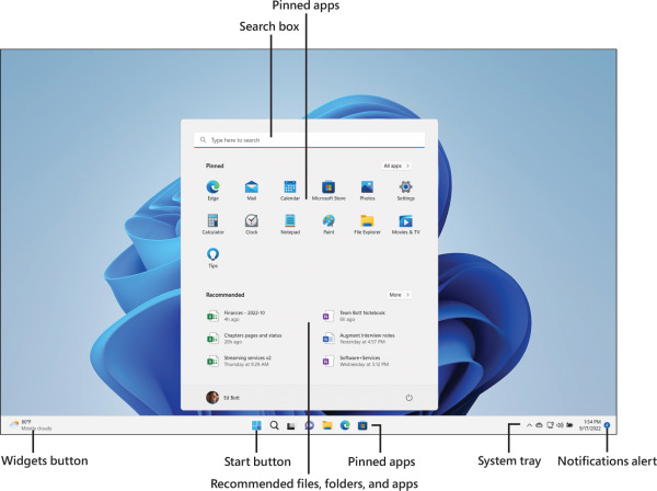
Figure 3-1 shows the two most important building blocks of Windows 11 and offers a hint of its signature visual style.

Figure 3-1 Compared to its predecessor, the Windows 11 Start menu is radically simplified.
When you first start up a PC running Windows 11, you see the familiar Windows desktop and taskbar. Clicking the Start button—the Windows logo at the left of a row of buttons centered along the bottom of the display—opens the Start menu.
Conceptually, the Windows 11 Start menu is similar to its immediate predecessor, but it differs dramatically in some key details. The most obvious difference is its position on the screen—centered at the bottom of the display rather than in the lower-left corner. But that’s just one of many important changes. Here’s a list of what else is changed from the Windows 10 Start experience:
There are no resizable tiles, live or otherwise. In Windows 11, all app buttons are the same size.
You can switch between a grid containing pinned apps and a scrolling All Apps list, but you can’t see both at once. In Windows 10, by contrast, the All Apps list is visible alongside the pinned app tiles.
The Power button, user profile picture, and shortcuts to common data folders are in a row along the bottom of the Start menu rather than in a thin vertical strip on the left side.
The Windows 11 Start menu is a fixed size. You can’t drag its borders to change its dimensions, and there’s no option to use it in full-screen mode.
A search box appears at the top of the Start menu, above the grid containing pinned apps. Tapping the Start button and then typing a search term (or clicking in the search box or clicking the search button on the taskbar, just to the right of Start) opens a different view of the Start menu that includes suggested web searches.
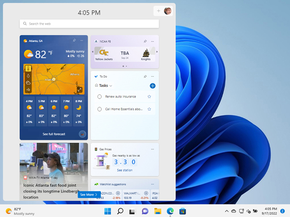
Also new in Windows 11 is the Widgets button, which appears by default at the far left of the taskbar. The button itself offers a quick view of the temperature and weather in the current location; clicking that button (or using the keyboard shortcut Windows key+W) opens the Widgets pane, which can be customized to show an expanded weather forecast, news headlines, stock prices, and tasks and calendar events from an associated Microsoft account, as shown in Figure 3-2.

Figure 3-2 The Widgets pane displays news headlines, sports scores, weather, and other tidbits of information. It’s customizable, and its button can be removed from the taskbar if you find it distracting.
We discuss how to customize the Widgets pane (or hide it completely) later in this chapter.
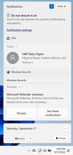
On the far-right side of the taskbar, just to the right of the clock, Windows displays a subtle icon (a number in a circle, whose color matches your Windows accent color) that alerts you to any notifications you have received from apps, services, or Windows itself. Click that icon to display the notifications pane, shown in Figure 3-3. (If you have no unread notifications, click the clock to open this pane.)

Figure 3-3 You can curate the list of apps and services allowed to interrupt you with notifications in this pane. You can also turn on a pair of features to temporarily suppress those interruptions and allow you to focus on work.
You can fine-tune the list of apps that are allowed to interrupt you, but even with all that attention, the notifications pane still contains ample opportunities for distraction, as meeting requests, email messages, and reminders compete for your attention. As a counterbalance, the Windows 11 notifications pane includes not one but two features designed to suppress those interruptions and allow you to work. We cover the Do Not Disturb and Focus features later in this chapter.
As with previous versions, Windows 11 offers multiple ways to switch between tasks. You can click the Task View button on the taskbar or use the keyboard shortcuts Windows key+Tab or Alt+Tab to quickly switch between apps. Windows 11 also offers much richer tools than its predecessor for arranging open windows in predetermined layouts on the screen. Allowing the mouse pointer to hover over the Minimize button, for example, offers a variety of “snap” options that are considerably more versatile than the Windows 10 equivalents.